


The Solution Franke+Fiorella identified the white space in the industry and filled it with vibrant color and science-driven graphics to express the innovative, contemporary qualities of the Valspar brand. Developed to be flexible and fluid, the visual identity was applied with broad strokes, reaching every brand touch point—from painted murals on office walls and employee awards to annual reports, stationery system and presentations. Identity standards guide best practices for on-brand communications.
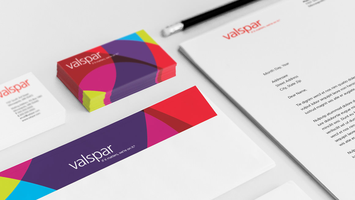
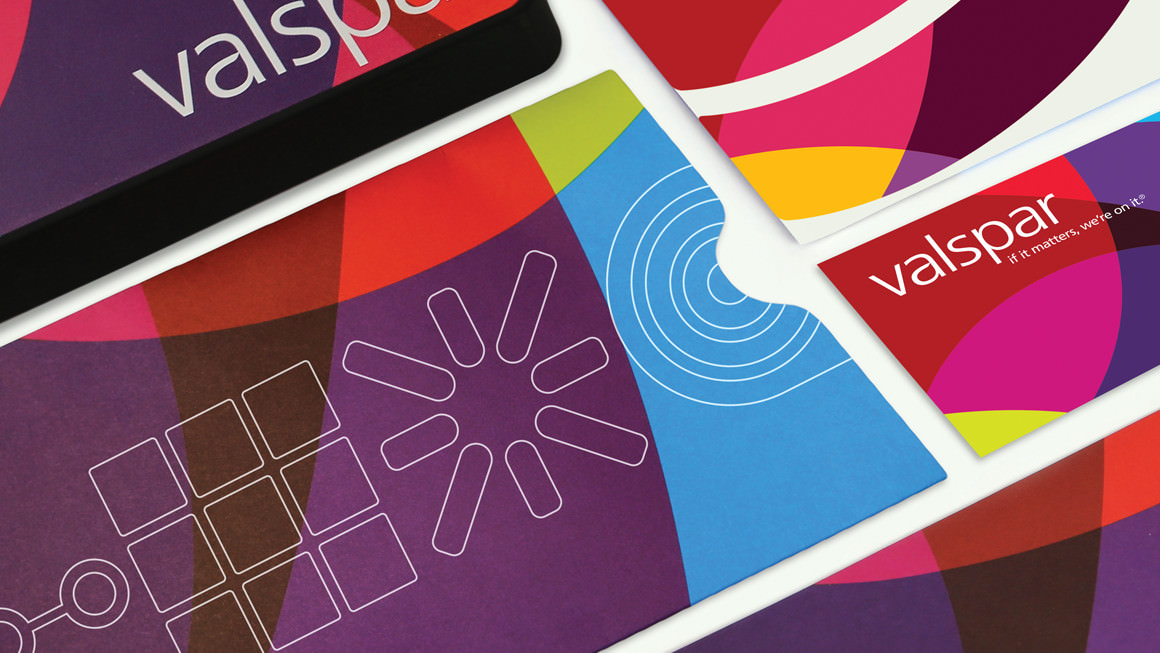
Of note. Brightly-colored graphics composed of overlapping shapes are a unifying element of Valspar’s visual identity system.
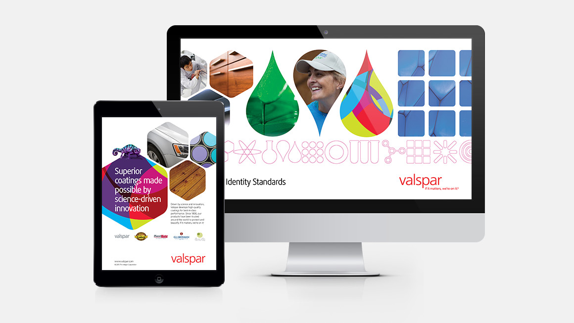
Color coordinated. One of Valspar’s chameleons, Jon, helps showcase Valspar’s breadth of consumer coatings in this brand ad. And brand guidelines communicate critical information to develop on-brand communications.
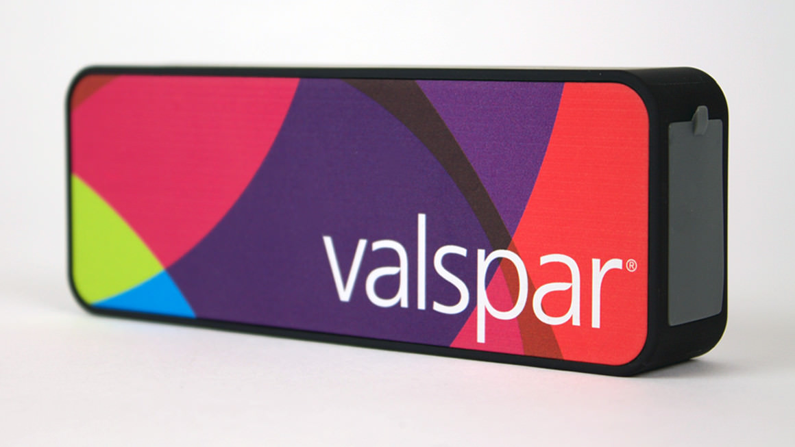
Turn it up. Valspar’s identity brightens merchandise, everything from Bluetooth speakers to tote bags.