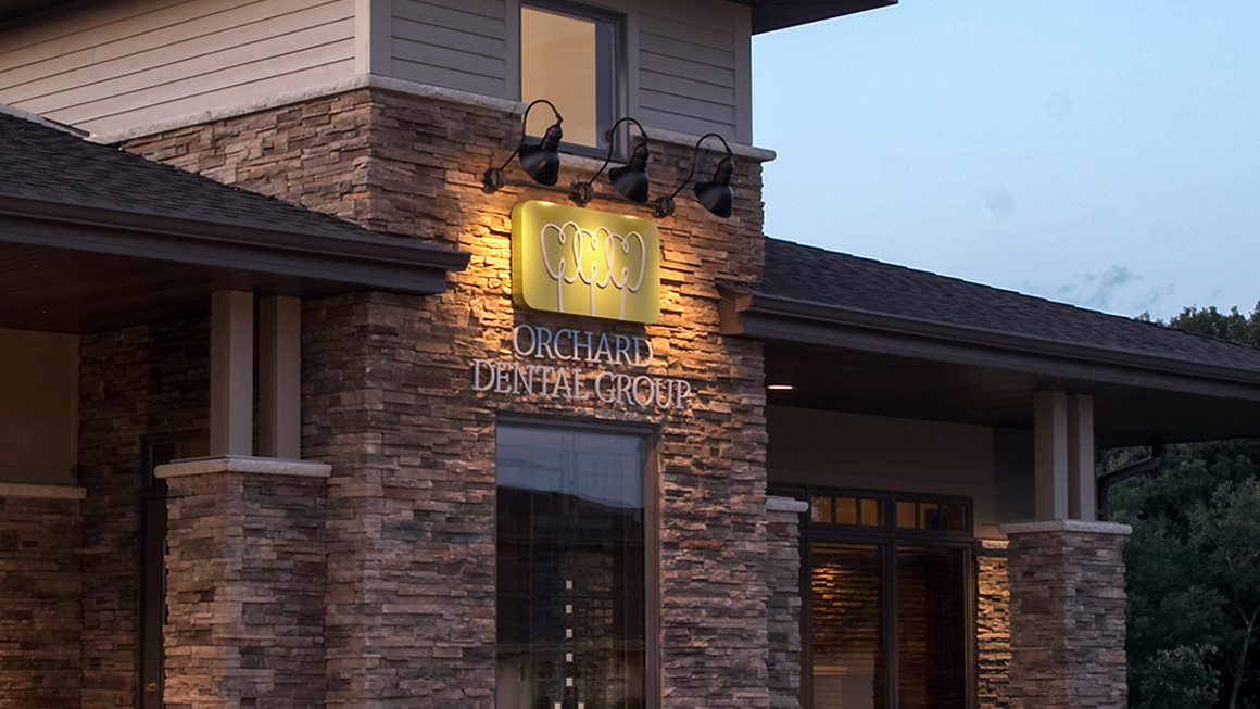
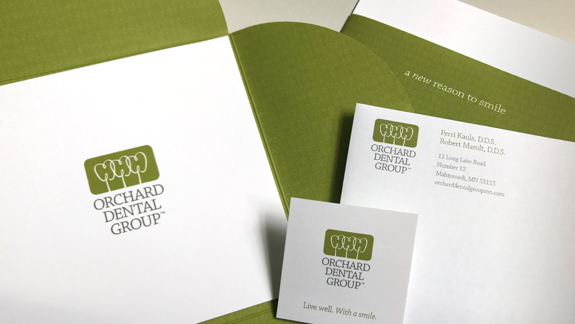
The Solution Franke+Fiorella developed a unique and memorable name that speaks to the approachability of the two founding dentists, and differentiates them from others in their market and connects historically to the region where they operate. The logo, a whimsical graphic representation of teeth and apple trees, positions their brand of dentistry as approachable yet professional and health and wellness centered. There is an elegance both to their style and to the architecture of their space; the logo and identity needed to reflect both. The soft green color palette exudes calm, a key part of how the dentists operate their business. Because they were establishing a new practice, the promotional materials featured both professionals, and presented their new identity through a distinctive self-mailer brochure.
The Result: The fact that the dentists needed to hire additional staff soon after opening is a testimony to their success.