

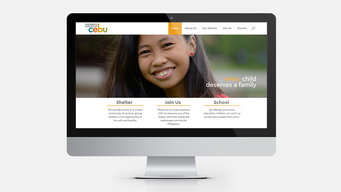
The Solution We created an authentic brand strategy that reflects the Children’s Shelter of Cebu mission. Based on the brand personality, a vividly colored logo using a childlike lowercase “i” was developed. With the truism of “a picture is worth a thousand words” in mind, we designed an image-centered visual identity system that captures the spirit of children in real moments at the shelter. Informal sans serif typography adds a contemporary, approachable feeling. Applied to all communications, from stationery system to website, the identity unites and strengthens the organization.
The Result Children’s Shelter of Cebu leaders revealed the brand identity at its annual banquet. Fundraising records were broken that night, with more than 14 percent of the annual budget raised. Families, donors and children from the shelter commended the work and expressed their gratitude for the opportunities it offers.
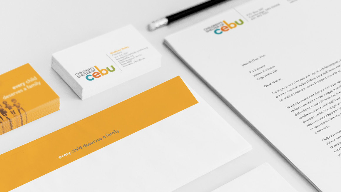
Best regards. A colorful stationery system offers warm greetings and conveys the organization’s reason for being.
Always in style. T-shirts and other wearables help people show their support for CSC.